
Appearance
Origin–destination
Three layers reading the same four columns. The images below all come from one query of twenty origin–destination pairs:
sql
SELECT o.lat AS origin_lat, o.lon AS origin_lon,
       d.lat AS dest_lat,   d.lon AS dest_lon,
       COUNT(*) AS trips
FROM journeys
GROUP BY 1, 2, 3, 4;
Only flow is built for you. Arc and line you add by hand.
arc
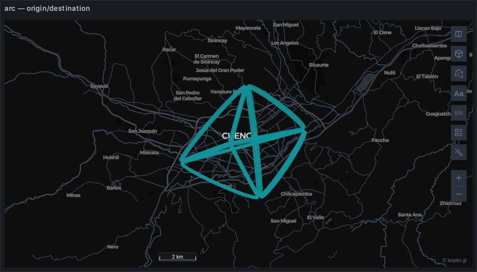
A curve rising between each pair, with separately controllable colours at the two ends — which is what makes direction readable without animation: colour the source one way and the target another and the gradient tells you which way it goes.
The height of the arc is proportional to the distance, so a map of long and short journeys gets a useful sense of depth. It also means a dense map becomes a bird's nest quickly; Brush in the interactions menu was more or less designed for this layer.
Backed by deck.gl's ArcLayer.
line
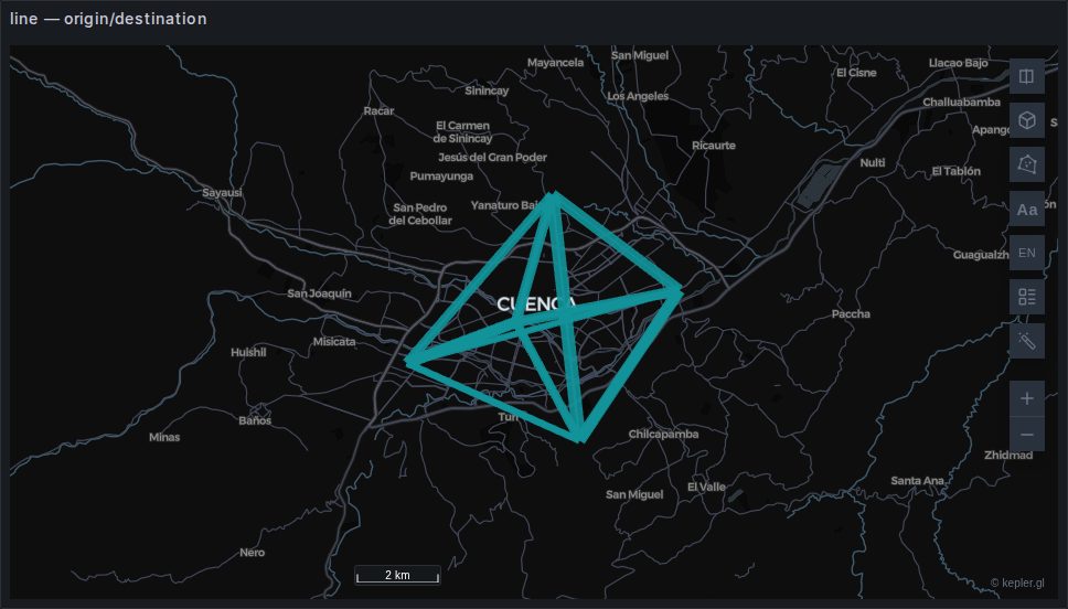
The same thing, flat. Easier to read on a dense map, and the right choice when the arcs' height carries no meaning you want.
A line is a flattened arc
kepler's Line layer is deck.gl's ArcLayer with the height forced to zero, not LineLayer. That is why its controls look identical to the arc layer's and why the two perform the same. See Under the hood.
flow
sql
-- the count column is what makes it a flow map rather than a network diagram
SELECT origin_lat, origin_lon, dest_lat, dest_lon, COUNT(*) AS trips
FROM journeys GROUP BY 1, 2, 3, 4;
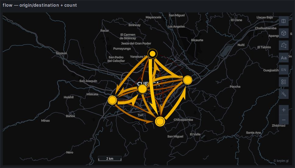
Built automatically. Tapered bands whose width encodes magnitude, with circles at the endpoints sized by total volume in and out. This is the layer for "how much moves between these places", where arc and line are for "what connects to what".
H3 works instead of coordinates — map origin_h3 and dest_h3. See Origin–destination flows.
Flow line style in the panel options chooses straight, curved or animated. Curved is worth reaching for as soon as your data is bidirectional: straight lines between the same two points sit exactly on top of each other, and a strong A→B flow becomes indistinguishable from a balanced pair.
Max Top Flows defaults to 5,000
Hand the layer more flows than that and the smallest are simply not drawn. If a flow you expect is missing from a dense map, that is the first thing to check.
Not a deck.gl layer
The flow layer comes from flowmap.gl, a separate visgl project bundled with the plugin — which is why its settings, clustering and adaptive scales among them, have no equivalent elsewhere in kepler and no entry in deck.gl's documentation.
It is also why the plugin pins a kepler.gl pre-release: the Flow layer exists nowhere in the 3.2 stable line.
Choosing between them
| You want | Use |
|---|---|
| Volume between places | flow |
| What connects to what, with depth | arc |
| The same, readable when dense | line |
All three want the aggregation done in SQL. A million individual journeys between two hundred zones is at most forty thousand rows after a GROUP BY, and the map cannot show you the difference.