
Appearance
Tutorial 3 — An origin–destination flow map
Commuting between six neighbourhoods of Cuenca, as an automatic flow map. About ten minutes.
You need: nothing but the panel — Grafana's built-in TestData DB again.
1. Create the panel
New dashboard → Add visualisation → TestData DB → Kepler Geospatial Maps.
2. Paste the data
Scenario → CSV Content:
csv
origin,destination,origin_lat,origin_lon,dest_lat,dest_lon,trips
Baños,Centro,-2.931,-79.056,-2.8975,-79.0045,1840
Yanuncay,Centro,-2.911,-79.023,-2.8975,-79.0045,1520
Ricaurte,Centro,-2.857,-78.96,-2.8975,-79.0045,1310
Machángara,Centro,-2.87,-78.988,-2.8975,-79.0045,1180
El Vecino,Centro,-2.885,-78.996,-2.8975,-79.0045,960
Centro,Yanuncay,-2.8975,-79.0045,-2.911,-79.023,870
Centro,Baños,-2.8975,-79.0045,-2.931,-79.056,830
Centro,El Vecino,-2.8975,-79.0045,-2.885,-78.996,640
Ricaurte,Machángara,-2.857,-78.96,-2.87,-78.988,420
Yanuncay,Baños,-2.911,-79.023,-2.931,-79.056,310
El Vecino,Ricaurte,-2.885,-78.996,-2.857,-78.96,240
Baños,Yanuncay,-2.931,-79.056,-2.911,-79.023,180
Twelve rows, each one a flow. One row is not one journey — the trips column carries how many.
3. What happened
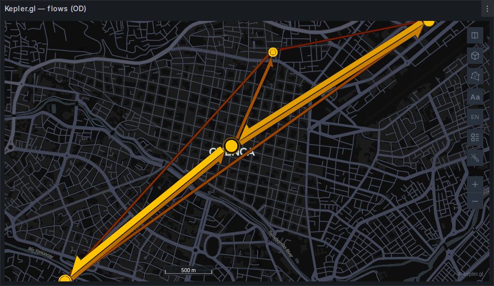
A flow layer, with tapered bands whose width is the volume and circles at the endpoints sized by total traffic through each place. You configured nothing.
Four columns did it — origin_lat, origin_lon, dest_lat, dest_lon — plus trips, which the panel recognises as the magnitude. All four coordinates are required; three of four is not a flow.
kepler does not auto-detect flows the way it does points and geometry, so the panel builds this layer explicitly. See Origin–destination flows.
Aggregate before the map, always
This table is already grouped. Real OD data starts as one row per journey, and a million journeys between two hundred zones is at most forty thousand flows after a GROUP BY — a difference the map cannot show you, but your browser certainly can feel.
4. The naming is flexible
The panel knows the conventions the wild actually uses. Any of these are recognised for the origin latitude: origin_lat, origin_latitude, from_lat, start_lat, source_lat, pickup_lat, lat0. Similar lists exist for the other three — pickup/dropoff from taxi data, from/to from network tables, source/target from graph exports.
If yours are not on the list, alias them in the query. All four are also mappable by hand under Field mapping.
5. Line style
Panel options → Flow line style. Try all three:
Straight is the default and reads best when flows are dense.
Curved separates the two directions of a pair. Look at Centro↔Baños in the data above: 1,840 one way and 830 the other. With straight lines those sit exactly on top of each other and a strong imbalance is invisible. With curved lines you see both.
Animated makes direction unmistakable, at some rendering cost — worth it on a wall display, questionable on a dashboard that also has eight other panels.
6. Read it
In the layer settings, colour and width scaling work as they do for any layer.
If a flow is missing
Max Top Flows defaults to 5,000. Hand the layer more than that and the smallest are simply not drawn. With twelve rows you will not hit it; with a real dataset it is the first thing to check before suspecting detection.
7. H3 instead of coordinates
If your zones are H3 cells rather than centroids, the same layer is built from origin_h3 and dest_h3 — and when a query carries both an H3 pair and a coordinate pair, H3 wins, on the grounds that a hexagon flow is the more specific description.
Those two roles are autodetect-only: there is no dropdown for them in Field mapping, so alias them in the query.
sql
SELECT h3_from AS origin_h3, h3_to AS dest_h3, count(*) AS trips
FROM journeys GROUP BY 1, 2;
8. Save
Map configuration → Save current map, then save the dashboard.
What you learned
- Four coordinate columns and a count are an automatic flow map.
- The panel builds this layer because kepler will not.
- Curved lines are the answer to bidirectional data, not a decoration.
- Max Top Flows is a display cap, and it is the usual reason a flow "disappeared".
- Aggregation belongs in SQL.
With your own data
sql
SELECT ST_Y(o.centroid) AS origin_lat, ST_X(o.centroid) AS origin_lon,
       ST_Y(d.centroid) AS dest_lat,   ST_X(d.centroid) AS dest_lon,
       count(*)         AS trips
FROM journeys j
JOIN zones o ON o.id = j.origin_zone
JOIN zones d ON d.id = j.dest_zone
WHERE $__timeFilter(j.started_at)
GROUP BY 1, 2, 3, 4;
Next
Tutorial 4 — A cross-filtered dashboard, where the map starts driving the other panels.