
Appearance
Time
One layer type, and one thing built on top of it that does not look like it at all.
trip
sql
SELECT vehicle_id AS trip_id,
       lat        AS latitude,
       lon        AS longitude,
       ts         AS time
FROM vehicle_positions
ORDER BY vehicle_id, ts;
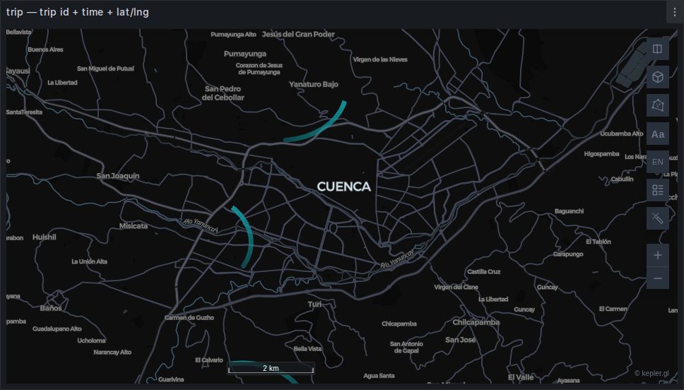
Built automatically from a trip id, a time and a position. The points are grouped into paths, sorted by time within each trip, and handed to kepler as an animated Trip layer with a playback timeline.
kepler will not build this one itself: its own heuristic insists on a column literally named id, and real trajectory tables call it vehicle_id, imei or device. So the panel emits the layer configuration explicitly. See Trajectories.
It draws nothing until the clock runs
The image above is a frame from partway through the animation. At the start of the window every trail has zero length, so a paused trip map at t=0 is a blank map. That is not a fault — it is what an animation looks like before it starts.
The same applies to screenshots: npm run docs:shots plays the animation for six seconds before capturing this panel, because otherwise the gallery would show an empty map.
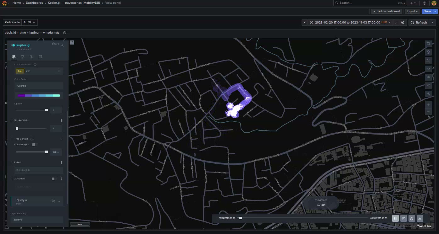
Trail length
The single control that changes the character of the map most. Short reads as a comet moving along the route; long reads as the route drawing itself.
kepler exposes it in the layer panel but does not document it. It is deck.gl's trailLength on TripsLayer, and kepler multiplies what you type by 1,000 before passing it on.
Table columns or GeoJSON
The Trip layer panel option picks between kepler's two shapes. The default, Table columns, keeps one row per GPS ping and with it every column your query returned — so speed, mode and driver stay available for colour, filters and tooltips. GeoJSON folds each trip into a single row carrying only the path: far less data, nothing else survives.
Backed by deck.gl's TripsLayer, plus ScenegraphLayer when a 3D model rides the head of the trip.
Velocity fields run on the same clock
A query returning a grid of wind or current vectors produces a Flow field layer, which traces streamlines through the field — the paths a massless particle would take — and animates a trail along each of them.
So the playback on this page applies to a wind map too: the same clock, the same play button, the same blank map when it is paused. What differs is that the geometry is computed rather than queried, and re-computed whenever the map settles, so density and on-screen line length stay constant as you zoom — and that its trail, cycle and density are the layer's own settings rather than the Trip layer's.
See Wind and other velocity fields.
Time without animation
A dataset with a time column but no trip id gets a time filter rather than a Trip layer — a histogram with a brush, over whatever layer you are already drawing. That is the right tool for "show me points in this window"; the Trip layer is for "show me things moving".
Both couple to the dashboard, in four different ways, with quite different costs. See Time range sync.