
Appearance
Tutorial 1 — Your first map
A month of global seismicity, live from the USGS, on a map you can pan. About ten minutes.
You need: the panel installed, and the Infinity data source — in the Grafana catalog and signed, so Administration → Plugins → Infinity → Install.
1. Add the data source
Connections → Add new connection → Infinity → Add new data source. No configuration is needed: the defaults are fine, because the URL is given per query. Save it.
2. Create the panel
New dashboard → Add visualisation → pick your Infinity data source → and in the visualisation picker at the top right choose Kepler Geospatial Maps.
3. Point it at the feed
In the query editor:
| Setting | Value |
|---|---|
| Type | JSON |
| Parser | Backend |
| Source | URL |
| Format | Table |
| URL | https://earthquake.usgs.gov/earthquakes/feed/v1.0/summary/2.5_month.geojson |
| Rows / Root selector | features |
That feed is every magnitude-2.5-and-above event of the last thirty days — a few thousand rows, which loads quickly. all_month.geojson has everything and is about 7 MB; save it for later.
4. Choose the columns
The response is GeoJSON, so each feature nests its position inside geometry.coordinates as [longitude, latitude, depth]. Infinity indexes into arrays with a dotted path, which is how you pull them out:
| Selector | Alias | Type |
|---|---|---|
geometry.coordinates.1 | latitude | Number |
geometry.coordinates.0 | longitude | Number |
properties.mag | mag | Number |
properties.place | place | String |
properties.time | time | Timestamp ms |
geometry.coordinates.2 | depth_km | Number |
Watch the order
Longitude comes first in GeoJSON. Index 1 is latitude, 0 is longitude — swapping them puts Ecuador in Somalia.
And set the coordinates to Number. Left as strings they parse to zero and every event lands off the coast of Ghana.
Run the query. You should get a couple of thousand rows.
5. What happened without you asking
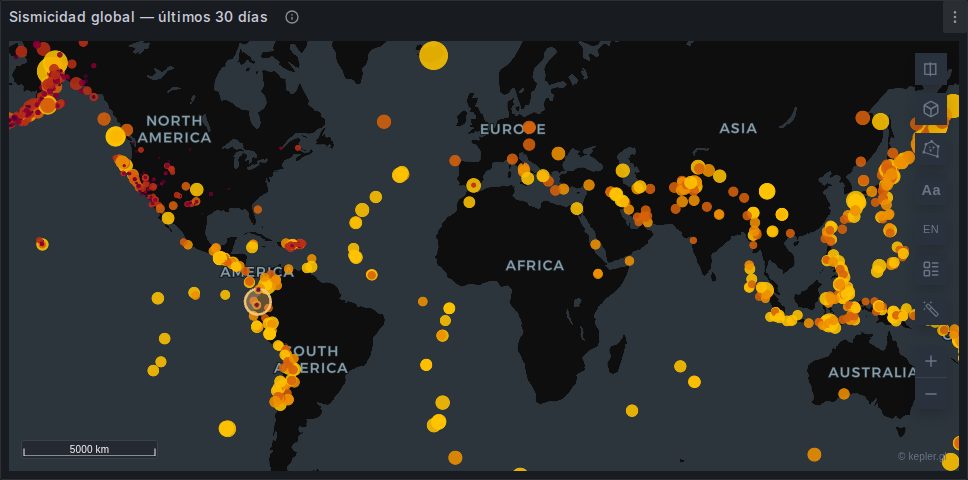
The map framed itself on the data and drew a Point layer. Nothing was configured — the panel recognised latitude and longitude by name, and time because Infinity typed it as a timestamp.
Two consequences of that time column: the map has a time filter with a histogram at the bottom, and the dashboard time picker now drives it. Set the range to Last 30 days so you can see everything the feed returned.
Cannot see anything?
kepler's default point radius is small, and on a world view a few thousand points can genuinely disappear. Open the layer panel on the left, click the Point layer, and raise Radius. This is the single most common "it did not work".
6. Make it readable
All of this is in kepler's own panel on the left. Click the Point layer to open its settings.
Colour by magnitude. Color Based On → mag. Pick a sequential palette — yellow through red reads as intensity without needing a legend.
Then change the scale from Quantile to Quantize. Quantile puts an equal count in each colour, which forces a fifth of all earthquakes into the top band and makes a magnitude 3 look alarming. Quantize uses equal ranges, which is the honest picture: the top band is nearly empty, because large earthquakes are rare.
Size by magnitude. Radius Based On → mag, and widen the radius range so the difference is visible.
Tooltip. Interactions → Tooltip → add place, mag and depth_km. Hover any event.
7. Play the month
Drag the brush on the time histogram at the bottom, or press play. The map filters as the window moves.
This is a kepler filter, not a query filter — the rows are all still loaded, so scrubbing is free and reversible. See Filters.
8. Save it
Layer styling lives in kepler's store, so it survives a refresh but not a page reload until you capture it:
Panel options → Map configuration → Save current map, then save the dashboard.
Reload the page. Your colours, radius and tooltip come back.
What you learned
- A query with recognisable columns needs no panel configuration at all.
- Infinity can reach into nested JSON and arrays with a dotted selector.
- Coordinate columns must be Number, and GeoJSON puts longitude first.
- Quantile and quantize scales tell different stories about the same data.
- Styling is explicit to save, and deliberately so.
Next
- Tutorial 2 — Animate trajectories, which needs no data source at all.
- Tutorial 4 — A cross-filtered dashboard builds directly on this panel.