
Appearance
Points and aggregation
Six ways to read the same 123 rows. Every image on this page comes from a single query returning latitude, longitude, a numeric value and a categorical zona — the difference is entirely in which layer you point at it.
sql
SELECT lat AS latitude,
       lon AS longitude,
       value,
       zona
FROM readings;
Only the first is built for you. The other five you add in kepler's layer panel: + Add Layer, pick the type, pick the dataset.
point
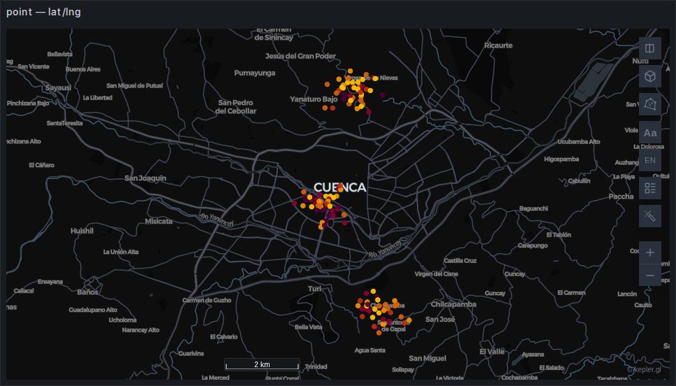
One circle per row. Colour and radius can each be driven by a column, which is usually enough to read a dataset before reaching for anything cleverer.
Built automatically from a latitude/longitude pair. Backed by deck.gl's ScatterplotLayer and the cheapest thing on this page — hundreds of thousands of rows is comfortable.
TIP
The default radius is small. On a country-sized view a few thousand points can look like an empty map; raise Radius before concluding nothing rendered.
heatmap
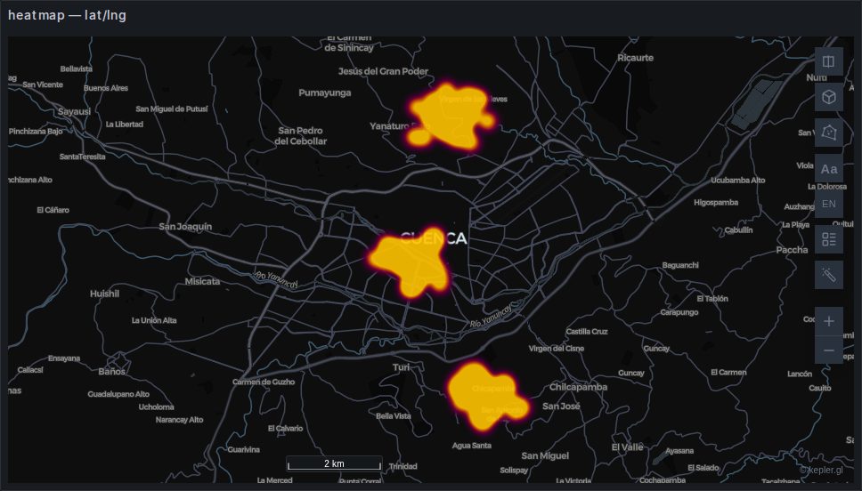
A continuous density surface. Good for "where is the concentration", useless for "how many" — there is no legend that makes a heatmap quantitative, and the apparent intensity changes with zoom.
Weight can be driven by a column; left alone it counts rows.
Backed by deck.gl's HeatmapLayer from @deck.gl/aggregation-layers.
grid
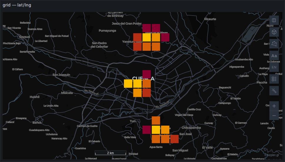
Square bins, sized in metres by Grid Size. Unlike a heatmap it is quantitative: each cell has a value you can colour and extrude, and a legend that means something.
Extrusion turns it into a 3D histogram, which needs the 3D control and reads best with a lighting effect turned on.
Backed by deck.gl's GridLayer.
hexagon
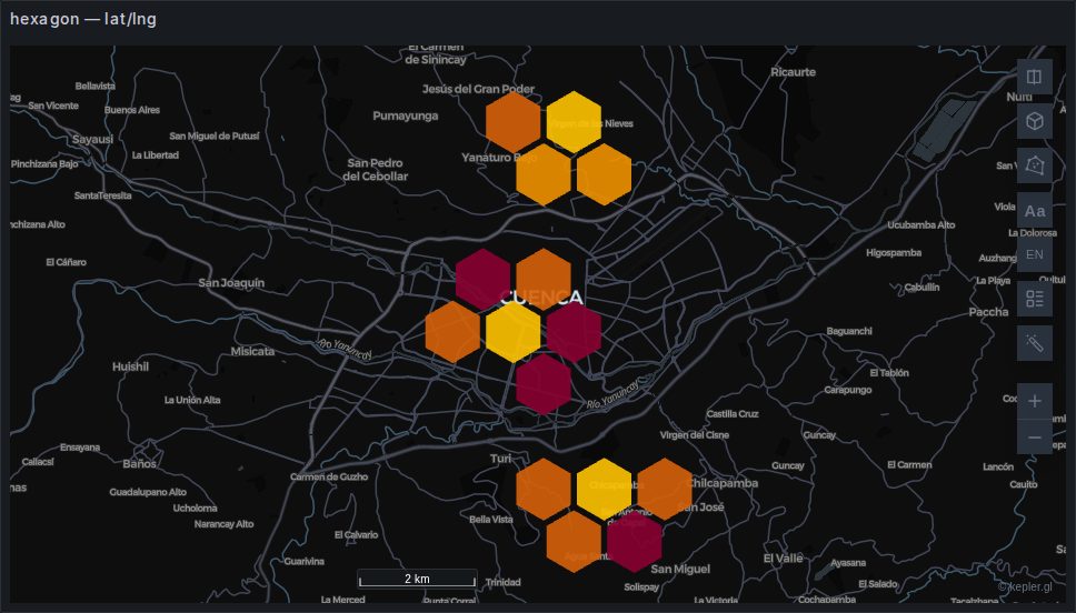
The same idea with hexagonal bins. Hexagons have a single distance to all six neighbours, which avoids the diagonal artefacts a square grid produces on clustered data — the reason most people prefer them for movement data.
Coverage shrinks each hexagon within its cell, which is how you get the gaps between them.
Backed by deck.gl's HexagonLayer. Distinct from the H3 layer: this bins raw points in the browser, while hexagonId draws cells your data already carries.
cluster
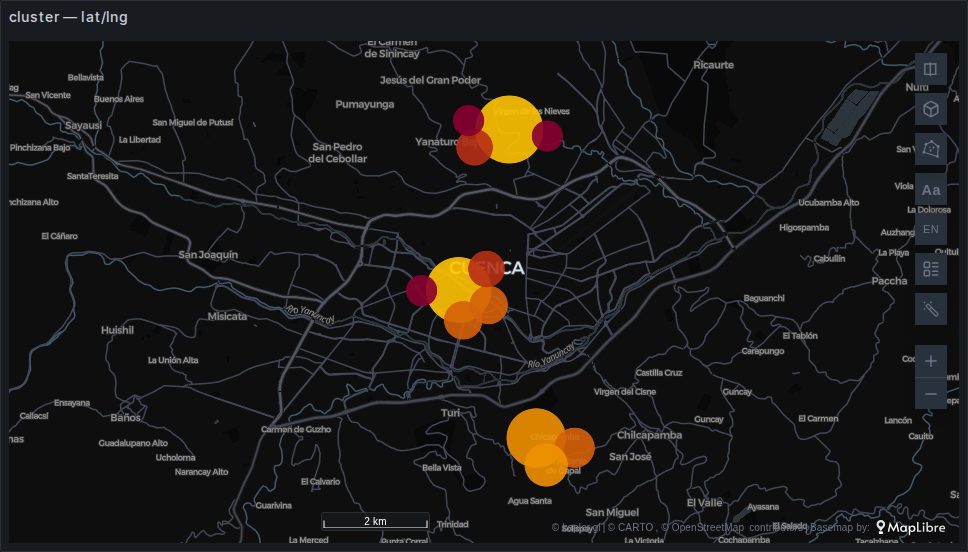
Points grouped into circles sized by how many they contain, re-clustered as you zoom. The familiar "47" bubble from web maps.
Better than a heatmap when the count matters and better than raw points when they overlap, but note that the clusters are a rendering artefact — they change as you zoom, so they are not a stable unit to compare.
Backed by a kepler CompositeLayer over deck.gl's ScatterplotLayer.
icon
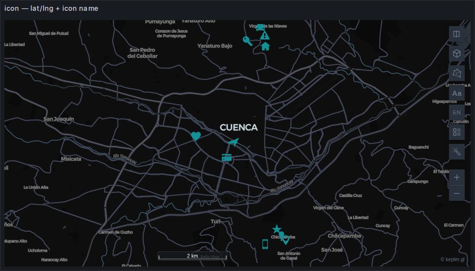
A symbol per row, chosen per row by a column holding an icon name.
sql
SELECT lat AS latitude, lon AS longitude, icon, zona
FROM stations;
The icon library ships with the plugin rather than being fetched from a CDN, which is what makes this work on an air-gapped install and under a strict connect-src. The names are kepler's own; the picker in the layer panel lists them.
Useful for a small number of meaningful things — stations, incidents, depots. At a few hundred rows it becomes noise.
Choosing between them
| You want | Use |
|---|---|
| Every row, individually | point |
| Where the concentration is | heatmap |
| Counts you can compare and extrude | grid or hexagon |
| A readable count at every zoom | cluster |
| Categorical symbols | icon |
And a rule that outranks all of them: if the aggregation can happen in SQL, do it there. A million rows binned in the browser is a million rows transported first. GROUP BY on an H3 index or a rounded coordinate sends a few thousand instead — see H3 and S2.